
What is bleed?
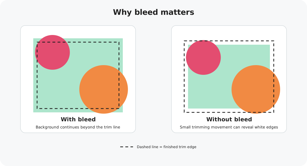
Bleed is the extra artwork that extends beyond the finished edge of your card. It is deliberately trimmed away during production.
Printing and cutting can move by a very small amount. Without bleed, that tiny movement could leave an unwanted white line along the edge of a design that is meant to run right to the edge.
If a colour, pattern, illustration or photograph is supposed to reach the edge of the finished card, continue it all the way to the edge of your uploaded artwork.
Your Marketplace bleed
Marketplace square artwork should be supplied at 15.4 cm wide × 15.6 cm high at 300 DPI. The required bleed is not the same on every edge.
Top bleed
Right bleed
Bottom bleed
Left bleed
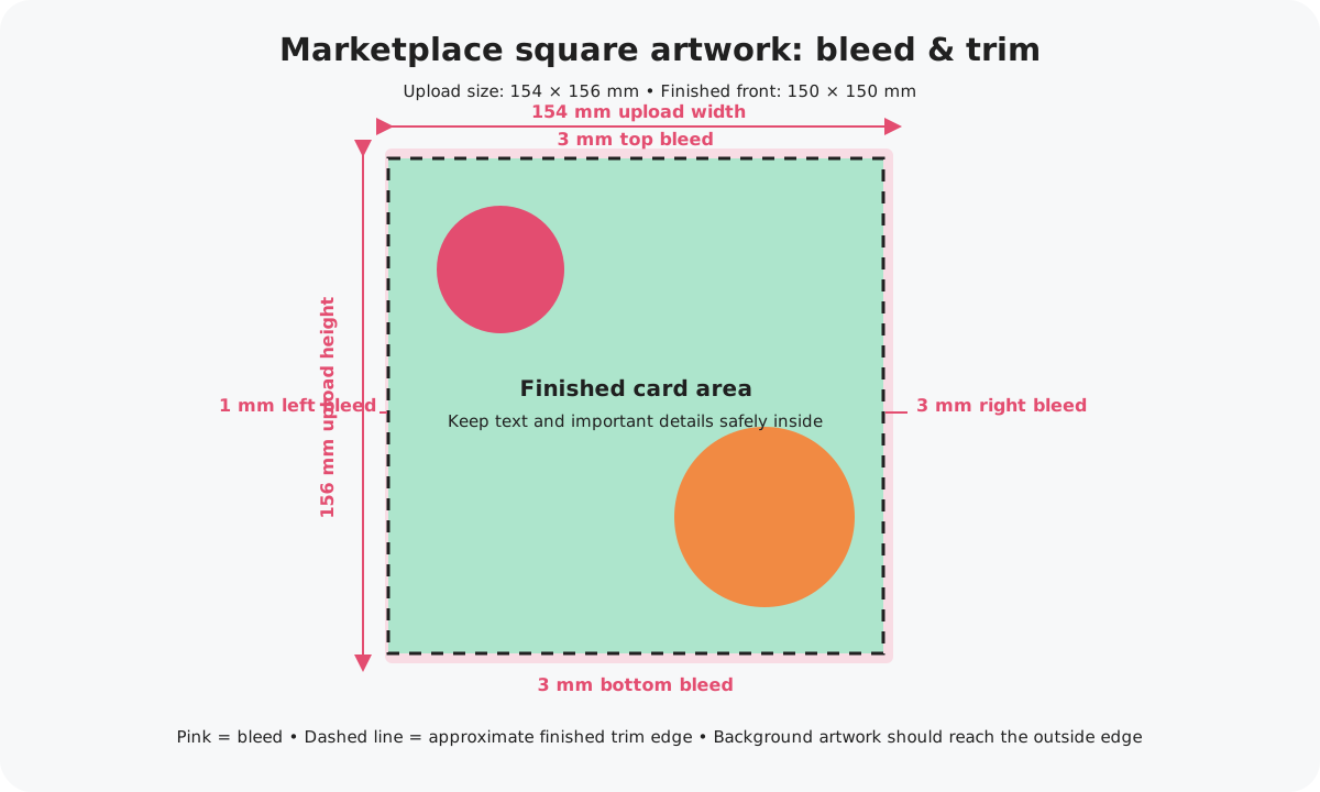
Do not add extra white space around your design to create bleed. The artwork itself needs to extend into the bleed area.
Bleed, trim and safe area
It helps to think of your artwork as three zones:
Bleed area
The outside area that may be trimmed away. Background artwork should continue through this area, but important content should not sit here.
Trim area
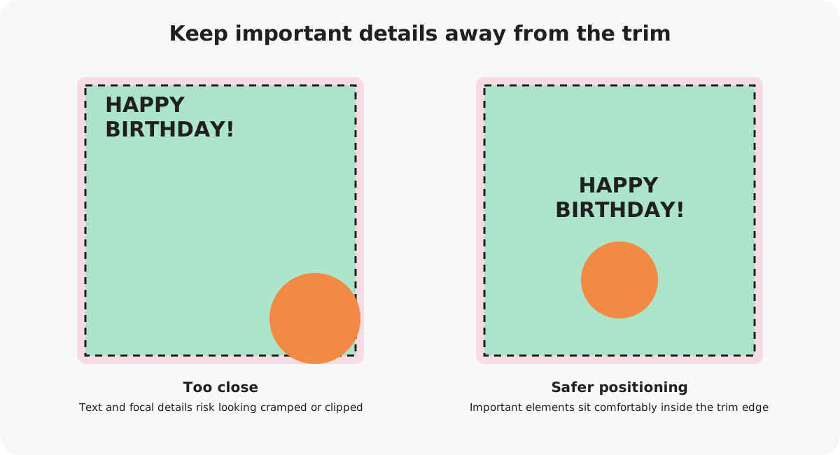
This is around where the card will be cut. Because trimming has a small production tolerance, avoid placing text, faces, logos or other important details directly against this edge.
Safe area
The central area where important elements belong. Keeping them comfortably inside the card helps make sure nothing looks cramped or risks being clipped.
What should extend into the bleed?
If the card has a coloured background, take that colour right to every outside edge of the artwork file.
Continue repeating patterns and textures beyond the intended finished edge.
If a photo runs to an edge, enlarge or position it so it continues through the bleed rather than ending at the trim.
Extend non-essential parts of illustrations beyond the trim where necessary, while keeping important details safely inside.
What should stay inside the safe area?
Anything that would noticeably affect the design if it were clipped should stay comfortably away from the trim edge.
Keep greetings, names, captions and other wording away from the outside edge.
Avoid positioning faces, hands or focal details where a small trim movement could cut into them.
Keep logos and branding inside the design rather than close to the cut line.
Be especially careful with borders. A border that sits close to the trim can look uneven if the cut shifts slightly.
Common bleed mistakes
Artwork stops before the edge
This can leave white around the outside of the uploaded file and means the design does not cover the full bleed.
Adding a white border to make the file bigger
Bleed needs to be a continuation of the background artwork, not extra blank canvas.
Text too close to the edge
Even if the wording technically fits, it can look cramped and may be affected by normal cutting tolerance.
Very thin frames near the trim
Small cutting movement is much more noticeable on symmetrical borders, so allow plenty of room or avoid very thin edge borders.
Check before you upload
There should be no accidental white or transparent gaps around edge-to-edge designs.
Check text, faces, logos and other focal elements.
Make sure any frame or border will still look balanced after trimming.
15.4 cm × 15.6 cm at 300 DPI.
Next: prepare the rest of your artwork
Once you understand the bleed and safe areas, use our complete square artwork guide to check resolution, colour and export settings too.